- STMicroelectronics Community
- STM32 MCUs Software development tools
- STM32CubeMX (MCUs)
- Re: STM32CubeMX on UHD (4K) display - clock config...
- Subscribe to RSS Feed
- Mark Topic as New
- Mark Topic as Read
- Float this Topic for Current User
- Bookmark
- Subscribe
- Mute
- Printer Friendly Page
STM32CubeMX on UHD (4K) display - clock configuration diagram too small to see
- Mark as New
- Bookmark
- Subscribe
- Mute
- Subscribe to RSS Feed
- Permalink
- Email to a Friend
- Report Inappropriate Content
2016-12-24 12:51 PM
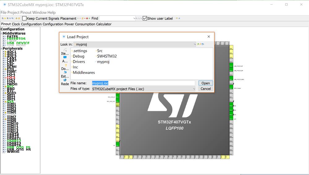
Using STM32CubeMX version 4.18.0 on Windows 10 Pro (build 1607) with an UHD (4K) display results in tiny toolbar icons and a very tiny Clock Configuration diagram. Please see attached screen capture image. Not that this application window is not maximized.
Is there any way to scale these images within the STM32CubeMX application so that I can see them with human eyes?
Additionally, the screen looks the same even when I drag the STM32CubeMX application to a different, lower-resolution monitor.
Any help would be appreciated.
Thanks,
Dale
#stm32cubemxSolved! Go to Solution.
- Labels:
-
STM32CubeMX
Accepted Solutions
- Mark as New
- Bookmark
- Subscribe
- Mute
- Subscribe to RSS Feed
- Permalink
- Email to a Friend
- Report Inappropriate Content
2017-09-16 11:06 AM
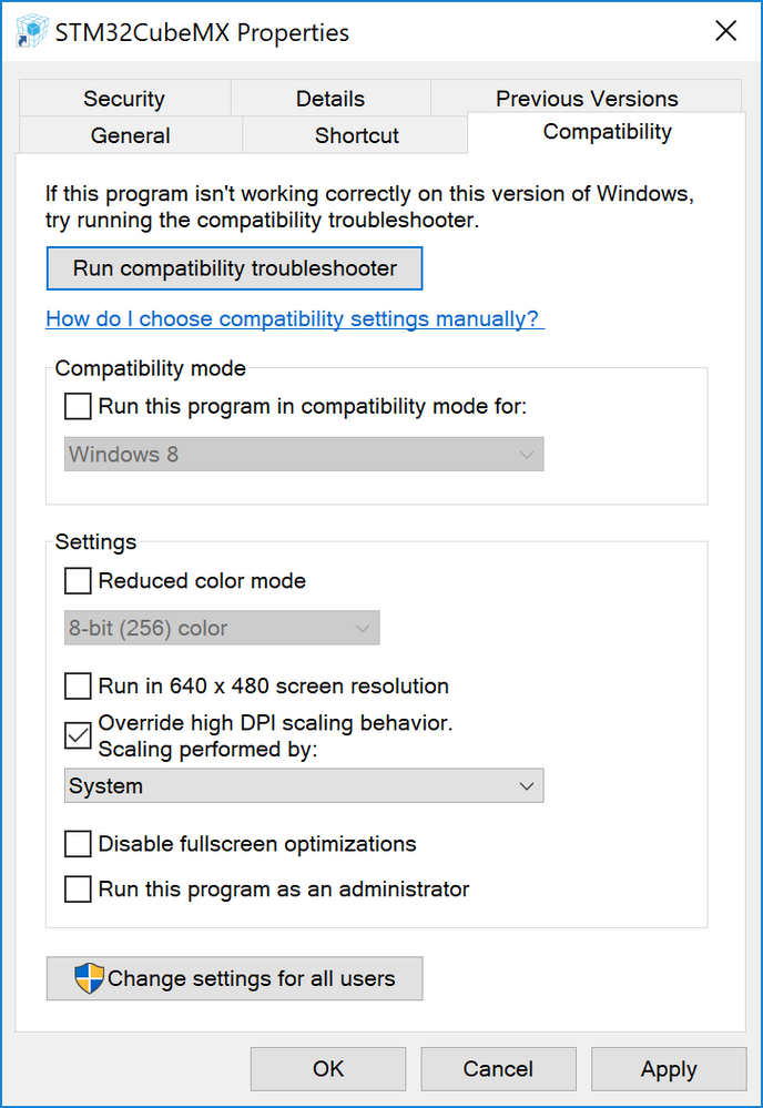
This is my workaround on a Windows 10 laptop.
- Right click STM32CubeMX launcher on the desktop and select Properties
- Open 'Compatibility' tab
- Check ''Override high DPI scaling behavior'
- Select 'System' from the combobox and click OK.
Now CubeMX should be lot more readable on a high resolution display.

- Mark as New
- Bookmark
- Subscribe
- Mute
- Subscribe to RSS Feed
- Permalink
- Email to a Friend
- Report Inappropriate Content
2016-12-25 02:22 AM
Dear
Wheat.Dale
,I will reportyour issue to our CubeMx teamfor checking and will come back to you as soon as possible.
Thank you for your contribution.
Best Regards
Imen
Thanks
Imen
- Mark as New
- Bookmark
- Subscribe
- Mute
- Subscribe to RSS Feed
- Permalink
- Email to a Friend
- Report Inappropriate Content
2016-12-25 04:55 AM
Imen,
Thank you. Do please let me know if you have an update on this issue.
Dale
- Mark as New
- Bookmark
- Subscribe
- Mute
- Subscribe to RSS Feed
- Permalink
- Email to a Friend
- Report Inappropriate Content
2017-01-16 03:02 AM
Dear Dale,
Have you used the zoom in feature? (available from the toolbar).
Doesn't it help?
- Mark as New
- Bookmark
- Subscribe
- Mute
- Subscribe to RSS Feed
- Permalink
- Email to a Friend
- Report Inappropriate Content
2017-01-16 08:01 AM
STM32Cube-T: Thank you for pointing me in the right direction.
The zoom function from the tool bar does help with viewing the Clock Configuration diagram, but it does not help with the microscopic tool bar icons themselves. Just finding the 'Zoom' icon is quite tedious, almost impossible.
- Mark as New
- Bookmark
- Subscribe
- Mute
- Subscribe to RSS Feed
- Permalink
- Email to a Friend
- Report Inappropriate Content
2017-02-06 01:19 PM
I hope this issue can be solved soon, because on 4k resolution sreens (like in my new laptop) the font and icon sizes are unreadable!!!
It seems that STM32CubeMX do not follow Windows? design schemes where up scaling is a must.Regards,
Helio Mendonca

- Mark as New
- Bookmark
- Subscribe
- Mute
- Subscribe to RSS Feed
- Permalink
- Email to a Friend
- Report Inappropriate Content
2017-03-05 12:44 AM
Hi
I have this problem too.
please help to fix this.
- Mark as New
- Bookmark
- Subscribe
- Mute
- Subscribe to RSS Feed
- Permalink
- Email to a Friend
- Report Inappropriate Content
2017-05-31 09:46 AM
I'd like to just toss my hat in the ring that high density display support is important.
- Mark as New
- Bookmark
- Subscribe
- Mute
- Subscribe to RSS Feed
- Permalink
- Email to a Friend
- Report Inappropriate Content
2017-05-31 03:54 PM
The scaling on CubeMX is awful, I'm really not sure why this is taking so long to fix or address. You really need someone to take ownership of the User Interface so the experience makes sense across a realistic range of platforms and displays. This means displays of assorted resolutions and aspect ratios.
Even on regular displays the initial size, scaling and fonts frequently seem non-optimal.
You can't build software that expects everyone to have a 1920x1080 display (or frankly any hard definition), when building consumer applications you have to build things that work on the hugely wide variations that the PC and MAC marketspace allows for. If this means part of the team needs a cross section of displays, and a focus of usability, then so be it.
Up vote any posts that you find helpful, it shows what's working..
- Mark as New
- Bookmark
- Subscribe
- Mute
- Subscribe to RSS Feed
- Permalink
- Email to a Friend
- Report Inappropriate Content
2017-05-31 06:32 PM
They look large on a 65' UHD panel....
Up vote any posts that you find helpful, it shows what's working..
- STM32CubeIDE Debug config in STM32CubeIDE (MCUs)
- CubeMX Custom Queue Sizes in FreeRTOS in STM32CubeMX (MCUs)
- STM32CubeMX Improvement idea: Clock Configuration (clock tree) in STM32CubeMX (MCUs)
- Nucleo H755ZI-Q: The interface firmware FAILED to reset/halt the target MCU in STM32CubeMX (MCUs)
- Configure RTC Alarm separately from RTC in STM32CubeMX (MCUs)