- STMicroelectronics Community
- STM32 MCUs Software development tools
- STM32CubeMX (MCUs)
- Re: Hi there! Does anyone think about working wit...
- Subscribe to RSS Feed
- Mark Topic as New
- Mark Topic as Read
- Float this Topic for Current User
- Bookmark
- Subscribe
- Mute
- Printer Friendly Page
Hi there! Does anyone think about working with STM32CubeIDE and STM32CubeMX on laptops (not big screens)?
- Mark as New
- Bookmark
- Subscribe
- Mute
- Subscribe to RSS Feed
- Permalink
- Email to a Friend
- Report Inappropriate Content
2019-11-16 5:02 AM
Hello! Does anyone think about working with STM32CubeIDE and STM32CubeMX on laptops? I have a laptop with a 15.6 inch 1280x1080 display.
Sometimes I program with it, it's awful there.
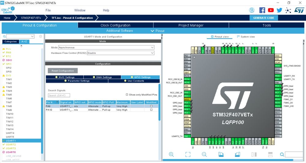
For example, this is the latest version of cubeMx on my screen.
To set the properties of the pins, I have to scroll up and down, up and down. At first it’s terrible to use. Secondly, I lost my “full view�?. It's prettier than the old version, but it's hard to use. Screen space is used very poorly.
I have no idea how to work in CubeIde ?! :sad_but_relieved_face:
- Labels:
-
STM32CubeIDE
-
STM32CubeMX
- Mark as New
- Bookmark
- Subscribe
- Mute
- Subscribe to RSS Feed
- Permalink
- Email to a Friend
- Report Inappropriate Content
2019-11-16 12:20 PM
There are zoom in out buttons and a fit to window button at the bottom. You can also drag it around to pan.
To be fair, you have a 100 pin part so it maybe just too much to make the whole thing readable on that screen.
The search tool is also quite useful, saves you needing to read the diagram much. But you will need to slide the bar left slightly to see the right hand side of it.
- Mark as New
- Bookmark
- Subscribe
- Mute
- Subscribe to RSS Feed
- Permalink
- Email to a Friend
- Report Inappropriate Content
2019-11-17 12:00 AM
Thank You very much for answer, I used tools what You say. But I told about bad interface made by ST programmers.
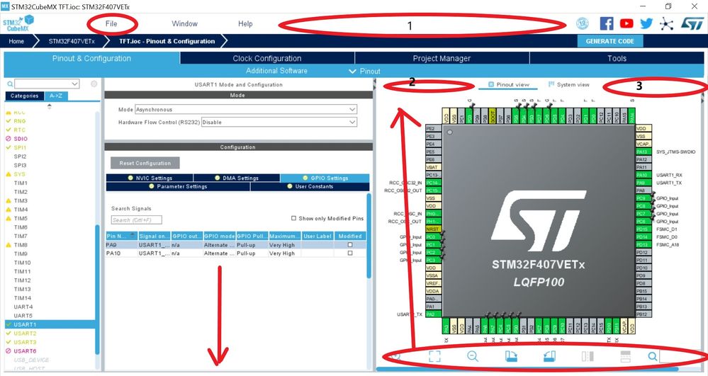
1) For example at the first line only one usable punkt: "File", And this punkt is used one or two times for session, You uderstand what I say? this punkt is used rarely, but take big space. Other space in this line not used.
2) 1,2,3 big free spaces, why?!
3) why pin configurations goues below of the screen?! I see sufficient space for it! (big down arrow)
4) all of buttons and menus (used/ not used) placed on the screen and take a space, like a childrens!!!, all pencils, screws, toys, books on the one table in one time.
5) line that starts "Home"... has no meaning!!!! File name may be placed at the "windows" window header for example....
6) In the CubeIDE where CubeMX placed into Eclipse, Project tree at left, Eclipse menu at top, Ecplise status bar at bottom...
Thats is impossible to use on displays below 32 inch :`(
I ask: someone think about user interface? or it is done randomly?
- Build Error in STM32H747-DISCO Project with TouchGFX, CubeMX, and FreeRTOS in STM32CubeMX (MCUs)
- STM32N657-DK in STM32CubeMX (MCUs)
- Just curious as to why there are no files in the Drivers and Middleware subdirectories. in STM32CubeIDE (MCUs)
- STM32CubeIDE in combination STM32H7Rx/7Sx some errors/bugs? in STM32CubeIDE (MCUs)
- STM32CubeIDE 1.18.0 released in STM32CubeIDE (MCUs)

