- STMicroelectronics Community
- STM32 MCUs Software development tools
- STM32CubeMX (MCUs)
- Re: CubeMX5 seems totally useless for developers w...
- Subscribe to RSS Feed
- Mark Topic as New
- Mark Topic as Read
- Float this Topic for Current User
- Bookmark
- Subscribe
- Mute
- Printer Friendly Page
CubeMX5 seems totally useless for developers with high DPI monitors :(
- Mark as New
- Bookmark
- Subscribe
- Mute
- Subscribe to RSS Feed
- Permalink
- Email to a Friend
- Report Inappropriate Content
2018-11-27 1:55 AM
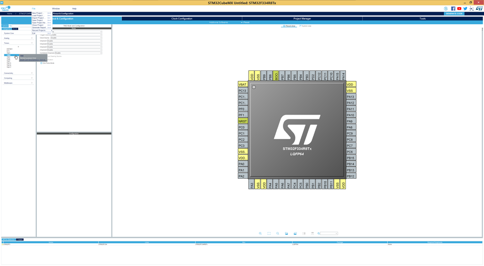
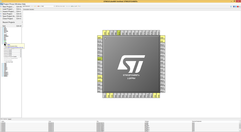
Currently text all over the GUI is VERY small!
Is it possible to make text of CubeMX 5 to be bigger for 4K monitors as it was in CubeMX4?
Who can easy read any text from such interface I wonder (see screenshot). The only advantage of CubeMX5 seems to be GUI (I did not found in explanations about v5 any other big changes) but GUI was made really worse because of total ignorance of high DPI :(
If this is a bug and not a design decision then how such things are reported to ST? Is there somewhere bugreporting service for CubeMX?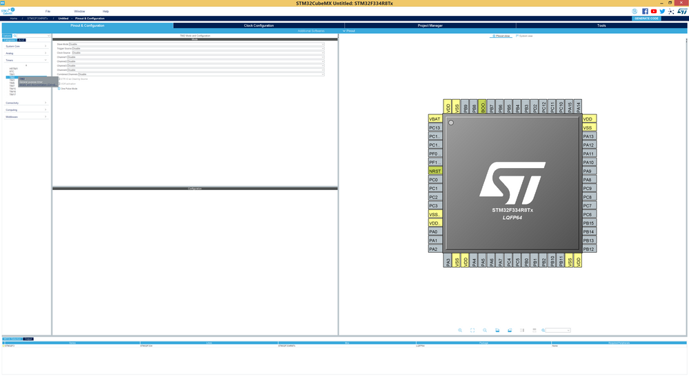
- Labels:
-
STM32CubeMX
- Mark as New
- Bookmark
- Subscribe
- Mute
- Subscribe to RSS Feed
- Permalink
- Email to a Friend
- Report Inappropriate Content
2018-12-14 10:03 AM
Hello Nawres Ghabi!
>Fonts size settings will be available in a coming release and we are fixing the GUI to fit well the UHD screens
You mean it would be possible to scale size of all text fields in the CubeMX? That would be a real help (if it would work it would be helpfull actually FOR ANY DISPLAY ... because there are many older developers with noticably worse sense of vision)
Or you mean something else by "Fonts size settings"? Sometimes settings allow to set scale for only very partial number of text fields.
P.S.
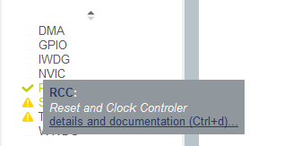
By the way I feel confused about coloring theme for helpfull tips
Dark blue on dark gray!? ... I personally recognize such text quite bad ... can you look at possibility to make coloring easier for reading? Tips coloring theme from CubeMX4 (on yellow background) was much better for reading then new one. May be it is possible to return to previous coloring theme or improve new one?
You can understand visibility fellings even better if you look at my original screenshot and scale it to size of you monitor (if it is not 40'' ;) ) ... you will get small messages with "dark on dark" text!
Do I need to create new question about that or just mentioning only here is quite enought?
- Mark as New
- Bookmark
- Subscribe
- Mute
- Subscribe to RSS Feed
- Permalink
- Email to a Friend
- Report Inappropriate Content
2018-12-18 10:28 AM
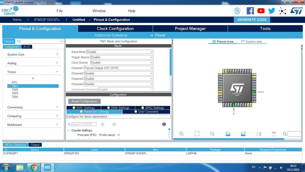
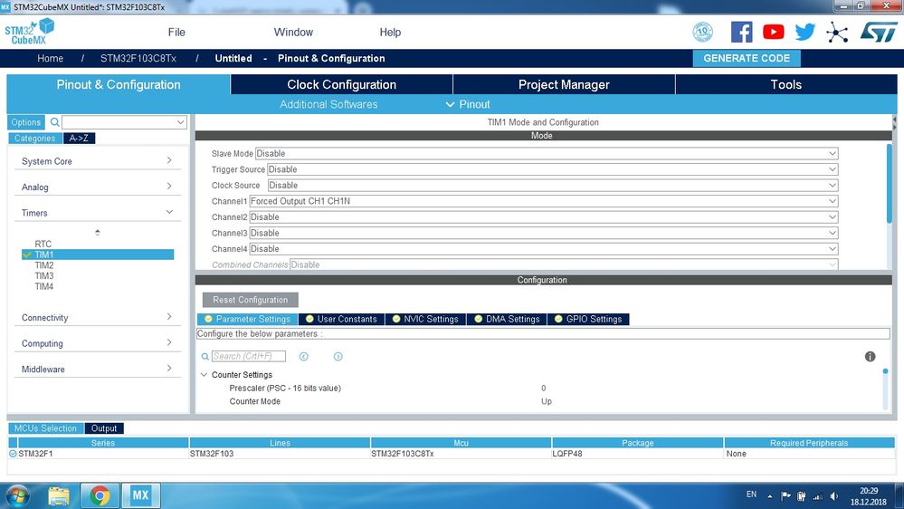
Ahahahaaaa! It's useles for LOW-DPI monitores too. In every window I can see one-two fileds.
Yes, I can resize ONE window using SPACE OF ANOTHER window while I cannot DRAG it to other place and to overview two windows in the same time! Best of the best UI
- Mark as New
- Bookmark
- Subscribe
- Mute
- Subscribe to RSS Feed
- Permalink
- Email to a Friend
- Report Inappropriate Content
2018-12-19 9:03 AM
Hi Nawres,
I have the same issue in that the font is unreadable. I have a 15" UHD, but also 2 32" HD monitors extending the display. It is basically unreadable on the laptop and does not translate well on the other monitors, and changing the scale so I can read this app makes the text for all other programs and apps too big. Basic conclusion is that the CubeMX of limited use when I have multiple windows open for other tasks that I am working on, or for documentation I am reviewing while trying to configure something in CubeMX. I don't plan on changing the scale back and forth to use it. I will just uninstall it and fall back to an older CubeMX, for the little bit I use it.
- Mark as New
- Bookmark
- Subscribe
- Mute
- Subscribe to RSS Feed
- Permalink
- Email to a Friend
- Report Inappropriate Content
2019-01-03 1:35 PM
So, the new version is out, but where is the option to change font size?
- Mark as New
- Bookmark
- Subscribe
- Mute
- Subscribe to RSS Feed
- Permalink
- Email to a Friend
- Report Inappropriate Content
2019-01-06 8:45 AM
Hello Nawres GHARBI (ST Employee)!
You have said that there will be changes in GUI for High-dpi monitors in next release and I can not see ANY improvements in arived CubeMX5.0.1. Please see sreenshot below
and compare it with sreenshot of 5.0.0 in a header!
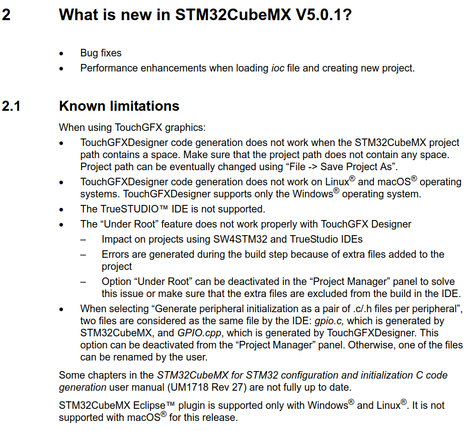
Known limitation for 5.0.1 does not have a word about unusability with high-dpi monitors:
One should be true ... there is a problem and it is clearly stated in Release notes known issues OR problem is fixed in the release. Or what?!
>Fonts size settings will be available in a coming release and
>we are fixing the GUI to fit well the UHD screens
There is ZERO improvements in GUI for High-DPI monitors ... not speaking about implementation of this promised great option :(
P.S.
Why things are so wrong with CubeMX5!?
For example please check font size of menu in screenshot of CubeMX5.0.1 and what ST already achived in CubeMX4:
ST already programed good font size for menus in CubeMX. Why CubeMX5 version is a regression in GUI (while GUI seems to be the only big change compared to CubeMX4)?
- Mark as New
- Bookmark
- Subscribe
- Mute
- Subscribe to RSS Feed
- Permalink
- Email to a Friend
- Report Inappropriate Content
2019-01-06 9:30 AM
Probably CubeMX5 is designed only for monitors of developers of CubeMX5 :)
CubeMX6 will probably will name us the model of this standard monitor ST bought for CubeMX team and we would need to find this exact model.
After I have seen zero improvements in GUI in CubeMX 5.0.1 I decided to return to latest CubeMX4:
https://www.st.com/resource/en/library2/stm32cube_mx_v4270.zip
or
CubeMX5 new GUI was not tested on real users before stopping development of CubeMX4 (with time-proven GUI). This big problem in project management of CubeMX team is the source of unusability of CubeMX5 for many users. CubeMX team is too much confident in the new things they do :(
P.S.
CubeMX developers probably never seen docking windows in their lifes and are not aware of adjustable windows thems so that users can specify there and that windows is needed for specific tasks and not like now: this window can be only on the left and that window only under it :(
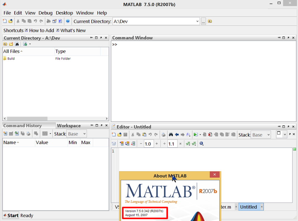
Instead of making interface adjustable by user the only difference in CubeMX5 GUI was to change it from one way of showing same windows to another way. Here is how Matlab IDE designed also on Java BUT 12 YEARS AGO is looking on high-dpi monitors in 2019:
All windows here are dockable and can be attached to any edge OR be merged with other windows in tabs-like way (like on left lower corner).
CubeMX5 developers are childs compared to developers of 12 years old software (we are speaking about development on same programming language ... so comparison is totally valid)
- Mark as New
- Bookmark
- Subscribe
- Mute
- Subscribe to RSS Feed
- Permalink
- Email to a Friend
- Report Inappropriate Content
2020-10-05 8:00 PM
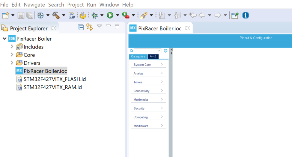
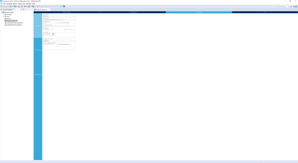
Well here we are 2 years later (4 years after the initial complaints on this topic), with CubeMX V6.0.1 inside CubeIDE and the problem is just as bad as ever. In fact, its worse, because CubeIDE scales BEAUTIFULLY on large monitors, until you open the MX configuration. It throws that into an editor window, and the terrible flaws of the MX UI are so blatantly obvious.
hint text is the worst:
It looks huge here.. but on my monitor its less than 2mm tall text. (yes. I measured!).
Developers dont really care about "new, slick, modern" UI. They just want to get their work done. Squinting or putting their noses to the monitor to is not productive. Neither is WIDE mouse movements from one button to the next, and then carefully positioning and hovering the mouse over those very tiny buttons in order to execute the action.
In tools for example, the plots are HUGE, but the controls for them are tiny.
and check out this ratio of utilized screen space in the project manager tab:
The lack of attention to this issue is incredibly frustrating. I dont have to to jump into CubeMX often, but every time I do the UI makes the whole process a struggle.
I want to love STM products. The chips are great. But its stuff like this that keeps people using Mbed or Arduino/Platform-IO rather than go any deeper.
Manufacturers development tools have historically always been utter crud. But its this kind of lack of attention to a MAJOR issue for 4 plus years that could EASILLY be solved that makes people think ST is ACTIVELY discouraging people from using their tools.
- Mark as New
- Bookmark
- Subscribe
- Mute
- Subscribe to RSS Feed
- Permalink
- Email to a Friend
- Report Inappropriate Content
2020-10-05 11:05 PM
Even if you choose Window > Font size > Larger ? That works for me on my 4k display using Win10.
- « Previous
-
- 1
- 2
- Next »
- STM32 CUBEMX not starting in STM32CubeMX (MCUs)
- User Authentication : why ?? in STM32CubeMX (MCUs)
- How to Start with Cube Monitor: Using Keil IDE for Development in STM32CubeMonitor (MCUs)
- CubeMX - we urgently need another panel with ridiculous text across the full width of the monitor screen. in STM32CubeMX (MCUs)
