- STMicroelectronics Community
- STM32 MCUs
- STM32 MCUs TouchGFX and GUI
- Re: Fonts appearance differed in the updated versi...
- Subscribe to RSS Feed
- Mark Topic as New
- Mark Topic as Read
- Float this Topic for Current User
- Bookmark
- Subscribe
- Mute
- Printer Friendly Page
Fonts appearance differed in the updated version
- Mark as New
- Bookmark
- Subscribe
- Mute
- Subscribe to RSS Feed
- Permalink
- Email to a Friend
- Report Inappropriate Content
2020-01-16 5:07 AM
Hi!
I encounter the issue with font appears differently in the old and new version of touchGFX.
The font I use : Noto Sans Medium.
In the old version (4.10) the Noto Sans Medium looks thin and tall
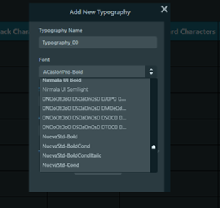
At the same time, typography name for Noto Sans Medium family is weird, see pic below.
In the new version (4.12) the Noto Sans Medium looks thicker, no problem with name display.
Now we kind of sure the thicker one is the correct one, but we want an explanation, what caused this difference?
Input from google font family: For use in web content: it is very important to use the fonts as web fonts. When a font is only specified in CSS font-family but not really delivered to the client as a web font, the browser will automatically fall back to another font. Some Noto fonts are available at Google Web Fonts Early Access. However, sometimes, it doesn’t serve the latest version of Noto or provides a subset of a font. In addition, be aware that the web latency for large fonts, such as for Noto Sans CJK, can be large.
Could this be possible explanation for the differences?
Looking forward to your answer
br
Devin
Solved! Go to Solution.
- Labels:
-
TouchGFX
Accepted Solutions
- Mark as New
- Bookmark
- Subscribe
- Mute
- Subscribe to RSS Feed
- Permalink
- Email to a Friend
- Report Inappropriate Content
2020-01-20 2:10 AM
Hi Devin,
TouchGFX 4.13.0 is out. Can you please check that? I know we've fixed issues related to this.
/Martin
- Mark as New
- Bookmark
- Subscribe
- Mute
- Subscribe to RSS Feed
- Permalink
- Email to a Friend
- Report Inappropriate Content
2020-01-20 2:10 AM
Hi Devin,
TouchGFX 4.13.0 is out. Can you please check that? I know we've fixed issues related to this.
/Martin
- Mark as New
- Bookmark
- Subscribe
- Mute
- Subscribe to RSS Feed
- Permalink
- Email to a Friend
- Report Inappropriate Content
2020-01-20 5:58 AM
Hi Matin,
Just checked with GFX 4.13, same thickness as the 4.12 version.
So it just the 4.10 version appears weird.
/Devin
- Mark as New
- Bookmark
- Subscribe
- Mute
- Subscribe to RSS Feed
- Permalink
- Email to a Friend
- Report Inappropriate Content
2020-01-21 3:49 AM
So, would you say 4.13.0 fixed the issue? :)
- Mark as New
- Bookmark
- Subscribe
- Mute
- Subscribe to RSS Feed
- Permalink
- Email to a Friend
- Report Inappropriate Content
2020-01-21 6:27 AM
Yes, or the 4.12 version has fixed the issue already.
Thanks!
- All themes except classic break IDE tabs and icons in STM32CubeIDE (MCUs)
- No HCI response to aci_gap_set_discoverable in STM32 MCUs Wireless
- Do the regular debugger-dead issues appear equally on Windows and Linux Cube IDE versions? in STM32CubeIDE (MCUs)
- [older versions and 2.17] STM32F767ZG GUI and command line display different (both wrong?) flash layout in dual mode in STM32CubeProgrammer (MCUs)
- Cant change editor background to full black in dark theme in STM32CubeIDE (MCUs)
