- STMicroelectronics Community
- About
- Feedback forum
- How do I get a more dense view of threads / posts
- Subscribe to RSS Feed
- Mark Topic as New
- Mark Topic as Read
- Float this Topic for Current User
- Bookmark
- Subscribe
- Mute
- Printer Friendly Page
How do I get a more dense view of threads / posts
- Mark as New
- Bookmark
- Subscribe
- Mute
- Subscribe to RSS Feed
- Permalink
- Email to a Friend
- Report Inappropriate Content
2023-06-17
1:30 PM
- last edited on
2023-06-19
1:58 AM
by
![]() Lina_DABASINSKA
Lina_DABASINSKA
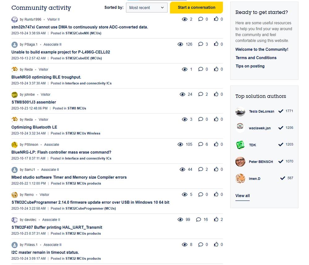
How can I get a more Classic Forum view, say just the Subject/Title, like an email client, where I can see 50 posts, perhaps 25 to the physical height of the screen?
Posting to main "Board" as there isn't a selection for "About Forum" or more appropriate venue.
Also no appropriate "Label"
Up vote any posts that you find helpful, it shows what's working..
Solved! Go to Solution.
- Labels:
-
Suggestion
-
UX-UI
Accepted Solutions
- Mark as New
- Bookmark
- Subscribe
- Mute
- Subscribe to RSS Feed
- Permalink
- Email to a Friend
- Report Inappropriate Content
2023-10-24 3:50 AM
For the time being, I have created a userstyle: https://userstyles.world/style/12669/community-st-com-condensed
.custom-message-list article.custom-message-tile,
.message-list article.custom-message-tile {
    padding: 10px 0;
}
.custom-message-list article.custom-message-tile > footer .UserAvatar > img,
.message-list article.custom-message-tile > footer .UserAvatar > img {
    height: 25px;
    width: 25px;
}
.custom-message-list article.custom-message-tile > div h3,
.message-list article.custom-message-tile > div h3 {
    font-size: 16px;
    padding: 8px 0 4px;
}
.custom-message-list article.custom-message-tile > div p,
.custom-message-list article.custom-message-tile > div figure,
.message-list article.custom-message-tile > div p,
.message-list article.custom-message-tile > div figure {
    display: none;
}
.custom-message-list article.custom-message-tile > aside,
.message-list article.custom-message-tile > aside {
    font-size: 10pt;
}
.custom-message-list article.custom-message-tile > div h3 *,
.custom-message-list article.custom-message-tile > aside *,
.message-list article.custom-message-tile > div h3 *,
.message-list article.custom-message-tile > aside * {
    font-size: inherit !important;
}
- Mark as New
- Bookmark
- Subscribe
- Mute
- Subscribe to RSS Feed
- Permalink
- Email to a Friend
- Report Inappropriate Content
2023-06-17 2:12 PM
@Lina_DABASINSKAITE Your help is much appreciated @Amel NASRI
- Mark as New
- Bookmark
- Subscribe
- Mute
- Subscribe to RSS Feed
- Permalink
- Email to a Friend
- Report Inappropriate Content
2023-06-17
2:34 PM
- last edited on
2023-06-19
1:42 AM
by
![]() Lina_DABASINSKA
Lina_DABASINSKA
Hi @Tesla DeLorean ,
You can customize your view from Your Profile > Settings > Preferences > Display.
I let @Lina_DABASINSKAITE confirm or provide appropriate answer to your questions.
-Amel
To give better visibility on the answered topics, please click on Accept as Solution on the reply which solved your issue or answered your question.
- Mark as New
- Bookmark
- Subscribe
- Mute
- Subscribe to RSS Feed
- Permalink
- Email to a Friend
- Report Inappropriate Content
2023-06-19 9:04 AM - edited 2023-06-19 9:05 AM
Hello @Tesla DeLorean,
as mentioned, you can customize your personal settings to define the number of topics to display on the page when viewing a forum board. However, if I understand your request correctly, you suggest only seeing the title/subject line of a post without the currently following teaser of the first few lines of the question. This would require a change in the CSS style. We will pass on your suggestion to Khoros as platform provider and get back to you as soon as we have more information on the feasibility.
Thanks,
Amelie
- Mark as New
- Bookmark
- Subscribe
- Mute
- Subscribe to RSS Feed
- Permalink
- Email to a Friend
- Report Inappropriate Content
2023-06-19 11:46 AM - edited 2023-06-19 11:53 AM
I don't think the current settings can achieve what I'm looking for. The image shows my screen height and relative density of the SparkFun vs ST Forum post list views. My gmail view is twice as dense as the SparkFun's, and I can increase or decrease the density/size via Ctrl[+] or Ctrl[-]
ST Implementation show about 4 post details per screen, vs 16 or so from SparkFun
Think of it as a more Executive / Manager view point, the title should convey enough detail to engage or not, and I can see replies/views and authors at a glance.
Up vote any posts that you find helpful, it shows what's working..
- Mark as New
- Bookmark
- Subscribe
- Mute
- Subscribe to RSS Feed
- Permalink
- Email to a Friend
- Report Inappropriate Content
2023-06-21 1:56 AM
Hi @Tesla DeLorean ,
Thanks for sharing. I can't promise the exact solution you pointed out but we will work on it with the UX team to make the activity display more extensive.
BR,
Lina
In order to give better visibility on the answered topics, please click on 'Accept as Solution' on the reply which solved your issue or answered your question.
- Mark as New
- Bookmark
- Subscribe
- Mute
- Subscribe to RSS Feed
- Permalink
- Email to a Friend
- Report Inappropriate Content
2023-10-24 3:50 AM
For the time being, I have created a userstyle: https://userstyles.world/style/12669/community-st-com-condensed
.custom-message-list article.custom-message-tile,
.message-list article.custom-message-tile {
    padding: 10px 0;
}
.custom-message-list article.custom-message-tile > footer .UserAvatar > img,
.message-list article.custom-message-tile > footer .UserAvatar > img {
    height: 25px;
    width: 25px;
}
.custom-message-list article.custom-message-tile > div h3,
.message-list article.custom-message-tile > div h3 {
    font-size: 16px;
    padding: 8px 0 4px;
}
.custom-message-list article.custom-message-tile > div p,
.custom-message-list article.custom-message-tile > div figure,
.message-list article.custom-message-tile > div p,
.message-list article.custom-message-tile > div figure {
    display: none;
}
.custom-message-list article.custom-message-tile > aside,
.message-list article.custom-message-tile > aside {
    font-size: 10pt;
}
.custom-message-list article.custom-message-tile > div h3 *,
.custom-message-list article.custom-message-tile > aside *,
.message-list article.custom-message-tile > div h3 *,
.message-list article.custom-message-tile > aside * {
    font-size: inherit !important;
}
- Mark as New
- Bookmark
- Subscribe
- Mute
- Subscribe to RSS Feed
- Permalink
- Email to a Friend
- Report Inappropriate Content
2023-10-24 5:14 AM
Hello @LWChris ,
Thanks for the effort and proposal, looks great! We are currently working on a "new look" and will implement the change once ready.
Regards,
Lina
In order to give better visibility on the answered topics, please click on 'Accept as Solution' on the reply which solved your issue or answered your question.
- Mark as New
- Bookmark
- Subscribe
- Mute
- Subscribe to RSS Feed
- Permalink
- Email to a Friend
- Report Inappropriate Content
2023-10-24 5:30 AM
Hello @Lina_DABASINSKAITE ,
that's great news! My userstyle was a quick makeshift solution, until the official "new look" is available from the settings, which obviously has a lot more potential by shuffling or reformatting the contents entirely.
The style's not perfect, but in the meantime it's getting the job done "good enough" I guess. I can get 9 topics in the space where usually 3 and a headline would've been. And most importantly, it's available now, giving your team as much time as necessary to thoroughly develop the actual board feature, while users have a simple way to achieve a better experience during the wait.
Best regards,
Chris
- Mark as New
- Bookmark
- Subscribe
- Mute
- Subscribe to RSS Feed
- Permalink
- Email to a Friend
- Report Inappropriate Content
2023-11-28 11:29 PM
Looks like this has been implemented ":natively".
One small step, and took not even even half a year.
JW
