
Fonts appearance differed in the updated version
Hi!
I encounter the issue with font appears differently in the old and new version of touchGFX.
The font I use : Noto Sans Medium.
In the old version (4.10) the Noto Sans Medium looks thin and tall
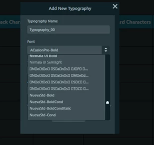
At the same time, typography name for Noto Sans Medium family is weird, see pic below.
In the new version (4.12) the Noto Sans Medium looks thicker, no problem with name display.
Now we kind of sure the thicker one is the correct one, but we want an explanation, what caused this difference?
Input from google font family: For use in web content: it is very important to use the fonts as web fonts. When a font is only specified in CSS font-family but not really delivered to the client as a web font, the browser will automatically fall back to another font. Some Noto fonts are available at Google Web Fonts Early Access. However, sometimes, it doesn’t serve the latest version of Noto or provides a subset of a font. In addition, be aware that the web latency for large fonts, such as for Noto Sans CJK, can be large.
Could this be possible explanation for the differences?
Looking forward to your answer
br
Devin