MM..1
Super User
December 3, 2021
Solved

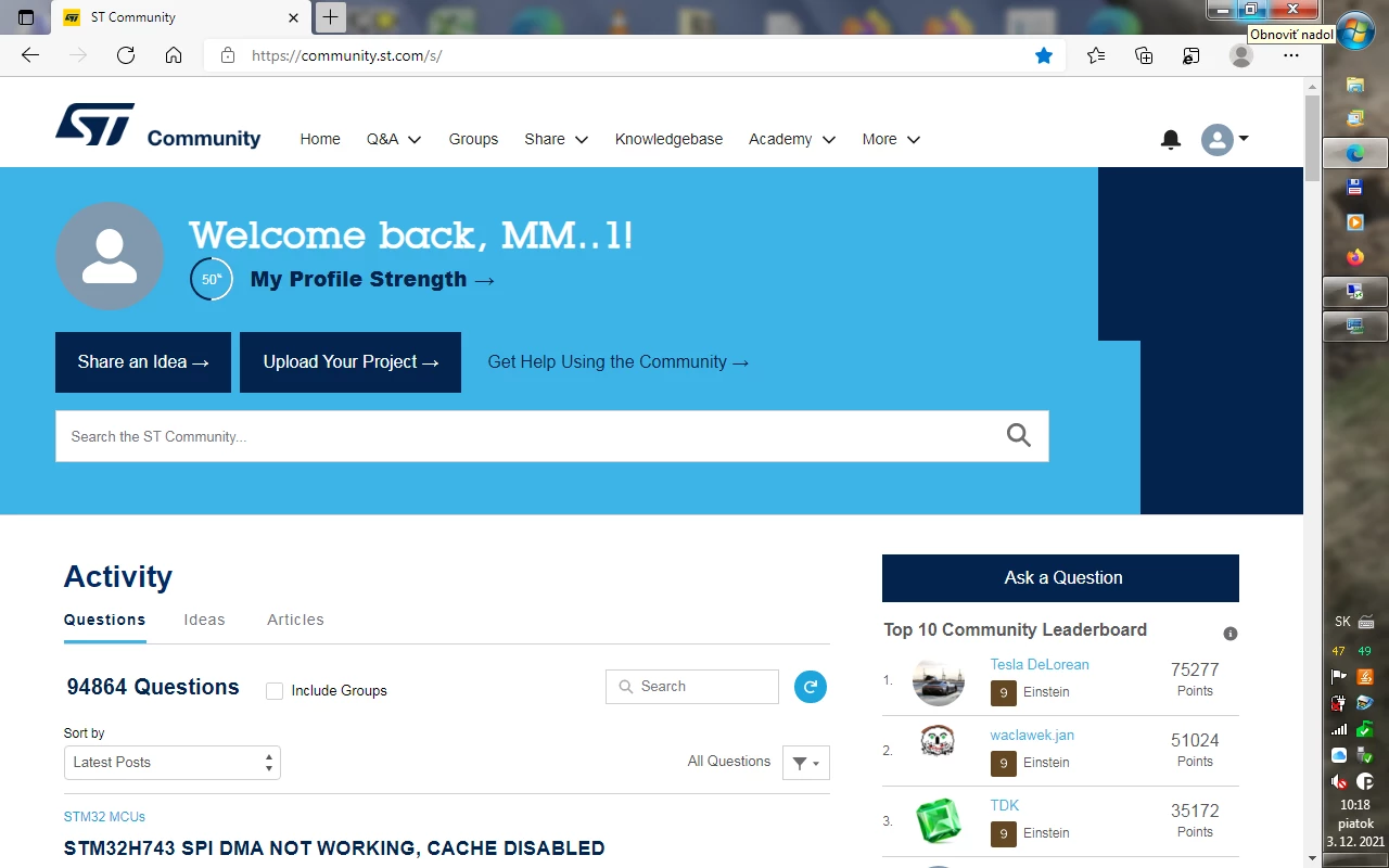
WTF go back to old community

This new disaster put to trash, an drevert back old version

0693W00000GZtdCQAT.png

    This topic has been closed for replies.
    waclawek.jan
    waclawek.janBest answer
    Super User
    December 15, 2021

    > Edit: I am happy to see that STM32CubeIDE is steadily improving

    I am not.

    It's the result of the same lazy and incompetent thinking that resulted in Salesforce being forced upon us instead of working towards real forum. This thinking, which prefers glitter to real gold, suckıng resources out of the real work, see https://community.st.com/s/idea/0873W000000KyjfQAC/detail. Remember, at the end of the day, it's us who are paying the price of all this in cost of chips. I am selfish and prefer paying for solid support rather than "clicky for the masses".

    Ultimately, this results in:

    > I don't know if it's coincidence, but the last week of questions has been particularly awful and low-effort.

    JW

    64 replies

    Andrew Neil
    Super User
    December 6, 2021

    The 'Community Help' section is full of posts like this:

    0693W00000HneAqQAJ.png0693W00000HneB5QAJ.png 

    Can you really not move these - rather than leave them cluttering-up the 'Community Help', and acting as a honeypot for other such posts?

    And, more fundamentally, does this not tell you that the signposting of where to ask questions is really bad?

    A complex system that works is invariably found to have evolved from a simple system that worked.A complex system designed from scratch never works and cannot be patched up to make it work.
    ST Employee
    December 7, 2021

    Hi @Andrew Neil​ ,

    We are working with our developers to address your feedback and fix the loading issue, please, stay reassured that your points are taken into account.

    About the messages in the Community Help section, moderators cannot move the post as is, as About this Community is a Group while the Questions feed is a different component.

    Thanks

    Andrew Neil
    Super User
    December 7, 2021

    @Laura C.​ "About this Community is a Group while the Questions feed is a different component."

    What does that even mean?

    As @Community member​ said earlier in this thread, "Forums need to be designed to serve the needs of the users" - and that does need to include moderators/admins.

    A complex system that works is invariably found to have evolved from a simple system that worked.A complex system designed from scratch never works and cannot be patched up to make it work.
    waclawek.jan
    Super User
    December 7, 2021

    The "rolling balls" bug appears to have been fixed by now, both in forum and in search.

    Eagerly awaiting removal of the clutter.

    JW

    December 8, 2021

    Yes, bravo to the ST team forthe quick reaction time !

    S.Ma
    Principal
    December 11, 2021

    OMG on popular Samsung Galaxy A51 using samsung default web browser the community site is nearly unuseable.... will free me some time...

    Andrew Neil
    Super User
    December 14, 2021

    "will free me some time"

    :face_with_tears_of_joy:

    tbh, I've never understood wanting to use a technical forum from a phone

    A complex system that works is invariably found to have evolved from a simple system that worked.A complex system designed from scratch never works and cannot be patched up to make it work.
    Michael K
    Senior III
    December 11, 2021

    I seem to have lost the ability to get bell or email notifications for replies to threads since the forum update. I've double checked my settings and they seem fine. I've even disabled and re-enabled all the checkboxes. However, some other members have told me they are not having this problem, so ¯\_(ツ)_/¯

    Embedded UI/UX Consulting: cadenza.design
    Andrew Neil
    Super User
    December 14, 2021

    I'm here via an email notification of your reply!

    A complex system that works is invariably found to have evolved from a simple system that worked.A complex system designed from scratch never works and cannot be patched up to make it work.
    TDK
    December 15, 2021

    I'd just like to agree with the rest of the folks here saying there is entirely too much clutter on the page. In addition to that, it really is sad that you can only see 8 topics in the span of a single page. That's a lot of scrolling required just to scan topics.

    I don't know if it's coincidence, but the last week of questions has been particularly awful and low-effort. I wonder if this is coming from the audience the new look is targeted towards. There should be some sort of page which describes how to ask a good question that we can point these low-effort posts to. There's only so much one can say when the question is simply "why doesn't my thing work?" with little to no supporting information.

    The presence by ST over the last ~year has been good as far as documentation issues go, but mostly poor in terms of actually answering questions. Maybe that is the intention. The forum does stress that this is a user community. The answers that ST members do provide are generally high-quality, however. With the occasional and unfortunate answers with misinformation thrown in.

    The Knowledgebase is good, but it's so hidden and hard to navigate that I wonder how many users actually know about it.

    The current state of the "About this Community" page is absurd with 90% of the questions being technical questions that have been closed. I am generally not for censorship, but in this case it makes no sense to show these questions on that forum just because the user submitted them there. Just hide them. Or delete them. Or move them to the correct forum.

    It's also weird that the posts that show up on the "STM32 MCU's" page is done by tag, not by where the user submitted the question. Usually forums have subfolders and such to categorize posts. Here it's just an odd grab bag.

    Anyhow, end of rambling. I try to ignore the annoying and frustrating parts of the forum and focus on the questions instead, and so I shall.

    Edit: I am happy to see that STM32CubeIDE is steadily improving and is currently MUCH better than previous Eclipse-based IDEs. It still suffers from Eclipse-isms, but there is nothing that can be done there.

    "If you feel a post has answered your question, please click ""Accept as Solution""."
    Andrew Neil
    Super User
    December 15, 2021

    @Community member​ - "There should be some sort of page which describes how to ask a good question that we can point these low-effort posts to"

    Better yet, something that is presented to new users before they get to make their first post.

    A complex system that works is invariably found to have evolved from a simple system that worked.A complex system designed from scratch never works and cannot be patched up to make it work.
    waclawek.jan
    waclawek.janBest answer
    Super User
    December 15, 2021

    > Edit: I am happy to see that STM32CubeIDE is steadily improving

    I am not.

    It's the result of the same lazy and incompetent thinking that resulted in Salesforce being forced upon us instead of working towards real forum. This thinking, which prefers glitter to real gold, suckıng resources out of the real work, see https://community.st.com/s/idea/0873W000000KyjfQAC/detail. Remember, at the end of the day, it's us who are paying the price of all this in cost of chips. I am selfish and prefer paying for solid support rather than "clicky for the masses".

    Ultimately, this results in:

    > I don't know if it's coincidence, but the last week of questions has been particularly awful and low-effort.

    JW
    TDK
    December 15, 2021

    I agree that there should be register level examples for most things, certainly for timers, uart, SPI, etc. Probably not for USB. They implemented the idea zone, that idea was BY FAR the most highly rated idea, and yet it's been dismissed. Shrug.

    But apart from that, I think HAL is a large improvement over SPL. Rather unfortunately, LL is a giant leap backwards but it's easy to ignore it.

    If we take STM32CubeIDE separate from the code generation in STM32CubeMX, I think most of the debugging features, fault analyzer, memory usage tools, peripheral register viewing, have been improvements. I like CubeMX for the pin layout and clock visualization, but not as much for the code generation.

    "If you feel a post has answered your question, please click ""Accept as Solution""."
    waclawek.jan
    Super User
    December 15, 2021

    > Probably not for USB

    This is a common misconception.

    In my "dozens of appnotes per module" model, I can envisage a couple of appnotes for USB in both its incarnations seen in STM32s, just to achieve enumeration, that's all register-level. And more dozens for the "auxilliary" features of USB such as sleeps, OTG-related, supply related...

    > But apart from that, I think HAL is a large improvement over SPL.

    In this, we will disagree. SPL was a honest mistake, HAL is a direct disaster. IMO this is consequence of poor microcontroller-oriented education in the schools, leading to (already second generation) of young people with only general programming education enter the field entirely unprepared (yes, I am electrical engineer).

    > debugging features, fault analyzer, memory usage tools, peripheral register viewing

    ... and user locking to proprietary tools.

    > I like CubeMX for the pin layout and clock visualization, but not as much for the code generation.

    That's the MX (MicroXplorer, CubeMX's predecessor) for you. Mind, this is all what 10 years of development of that product brought. Let me remind you that it's we who pay for all this.

    JW

    waclawek.jan
    Super User
    December 15, 2021

    I believe ST ticked this already off as done, but it's not.

    • the clutter is still there - just remove it and learn the lesson
    • frontpage still nags me with "onboarding" even if I ticked "don't nag me again"
    • the "personal feed", while brought back and put on the front, is still in the unusable "threaded" view, it needs to be list
    • and I've just discovered another one - the comments list in Ideas shows only 6 comments and there's no way to see more

    I'm not talking about the years old bugs which are still mostly here, but what you've brought in with the latest "update". As MM aptly said, just revert - it was bad but not this bad.

    JW\

    @Camilo LEMOS​ 

    Camilo LEMOS
    Associate II
    December 15, 2021

    Hi @TDK​ @Community member​ and all participants in this thread.

    Let me start by saying that your voices are not being ignored - far from it. Both the feedback on the new design of the community and on the general performance of the current forum platform is being heard - and actioned - daily. We hear loud and clear that you are dissatisfied with the new look of the forums and that you would prefer the forums to be hosted on a different platform more suited to your needs. This feedback is being heard and transmitted across all necessary teams in the company. Unfortunately, not all fixes - and specially major changes - can be done as quickly as we would like them to. Also, please keep in mind that nobody in the Community Team is interested in providing you with an experience which values "pretty" or "trendy" over useful - our commitment is to bring you the community you want to have; the situation is, however, that we have to address the low-hanging-fruit while working on broader and more complex structural solutions and changes.

    To the points you raised, let me address them as clearly and transparently as I can:

    @TDK​ :

    • clutter on pages: some of it can be removed, some of it can be reduced (banner size, for example),. Some of what @Andrew Neil​ highlighted cannot be taken away from the page (such as the filtering and sorting options). These have been logged with our IT team, but are not quick fixes.
    • limit of 8 topics per page: I'm not sure I understand this one. The homepage and all topic microsites (such as STM32 MCUs, for example) have pagination components which allow you to view up to 100 threads per page. Did I misunderstand?
    • Low-effort questions: I cannot categorically say this isn't due to the new design, but we have not promoted the new look of the community through external channels so I'm skeptical as to this being due to the redesign. With that said, we are working on ways to educate new members of the community on how to post good questions. These efforts have been hindered by technicalities related to the implementation of the new look and features of the community, but are now back on track.
    • About The Community: this seems to be due to some unfortunate design and nomenclature choices on our side when we launched the new community. The main culprit is the "Get Help" button available on the home page banner. We are working to have it removed, not as simple to do as it looks.
    • Knowledgebase: good point! We'll work to make it more visible. How do you find it hard to navigate?

    @Community member​ 

    • the clutter is still there: please see my comment to TDK above.
    • frontpage still nags me with "onboarding" even if I ticked "don't nag me again": I've logged this as a bug.
    • the "personal feed", while brought back and put on the front, is still in the unusable "threaded" view, it needs to be list: I've changed the settings to collapse comments just now. Looking with our IT team into the possibility of changing the display to a simple list.
    • and I've just discovered another one - the comments list in Ideas shows only 6 comments and there's no way to see more: I've logged this as a bug.

    Aside from the points you've raised, there are 8 other items being worked on.

    Thank you for your patience while we work on this. And please, keep sharing your thoughts and feedback - we will absolutely work on all the items you list here on this thread.

    TDK
    December 15, 2021

    > limit of 8 topics per page

    I mean that, without scrolling, you can only see 8 topics per page. I think it should be more like 20, which would allow you to scan topics easier. Info could be compressed here to make better use of the vertical space. Although I did look at other forums and was surprised that the average posts per vertical page is about 12-15. ST was still the worst, but not a huge outlier.

    0693W00000Hoj7KQAR.png 

    > Knowledgebase

    Hmm, did this change in the past 2 weeks? The current layout looks good. I retract my comment about that. I remember it showing only 6 posts per topic and needing to click on "show all" or something.

    "If you feel a post has answered your question, please click ""Accept as Solution""."
    Andrew Neil
    Super User
    December 15, 2021

    @TDK​ "I mean that, without scrolling, you can only see 8 topics per page"

    Which is made all the worse by all the people putting the entire question in the title - as seen in the 2nd item in your screenshot.

    :pouting_face:

    A complex system that works is invariably found to have evolved from a simple system that worked.A complex system designed from scratch never works and cannot be patched up to make it work.
    waclawek.jan
    Super User
    December 15, 2021

    Hi @Camilo LEMOS​ ,

    Thanks for chiming in.

    This last update brought

    • unnecessary aesthetical changes (the clutter on top, in trendy blocks and colors)
    • a push for some unneeded "social" functionality ("onboarding")
    • no (= zero) functional improvement

    And you never attempted to discuss those changes here.

    All we need is a working forum and ST's active participation. Everything else are perks which are nice, but optional, and should never get into way. Your convenience (aka integration to internal systems, e.g. the password system and others) is secondary, and again, should be entirely invisible and never get into way.

    My example is https://www.eevblog.com/forum/index.php (probably based on simplemachines.org, which itself has probably phpbb heritage). Sure, it has its shortcomings, as everything does, but this is as close to pure, technical, simple, fast, functional as it gets. It incorporates probably three decades of forum creation wisdom; that simply cant' be overcome, no matter how much ajaxo-javascriptoids do the script kiddies throw at their creations.

    My 2 eurocents. Arguable, as usually.

    JW

    PS. I highly recommend to make a static snapshot of the whole forum, there are multiple reasons to do so regularly.

    S.Ma
    Principal
    December 15, 2021
    waclawek.jan
    Super User
    December 15, 2021

    That's PHPBB (as was the old avrfreaks, I linked above through archive.org). While simplemachines is said to be a clean design, it very obviously followed PHPBB's patterns.

    JW

    Camilo LEMOS
    Associate II
    December 15, 2021

    Hi @Community member​ 

    I hear you loud and clear about your expectations for the community, no doubt about that, and I agree that our internal systems should never get in the way of the usability of the community. We are working towards that, I guarantee, but I have to be realistic and say that you will probably not see major changes to the structure of the community and its systems in the next couple months.

    To your points:

    • unnecessary aesthetical changes (the clutter on top, in trendy blocks and colors) - while colors and style are a matter of opinion, I do recognize that the top banners are too big and I have already opened a ticket for it.
    • a push for some unneeded "social" functionality ("onboarding") - I disagree that the onboarding flow is social functionality. It serves to decrease navigation pains for new members, help them get acquainted with the different areas of the community, teach them how to follow their topics of interest, etc. One of the strongest points of feedback we've historically heard from our new members on this platform is that navigation is difficult - this is one of the steps towards improving that (while being aware that the navigation itself needs to be improved).
    • no (= zero) functional improvement - we did implement one functional improvement which, while it should have been there in the first place, was one of the biggest asks I've received from the community over the past two years: the profile feed is now able to show each type of activity separately and it displays in chronological order - the way it should have been in the first place. We had plans for several functional improvements which were blocked due to platform limitations, unfortunately.

    Thank you!

    S.Ma
    Principal
    December 15, 2021

    Make the scoreboard and ranks to use and maybe show the forum differently for a newbee from veteran ?