New community platform: Excessive screen space usage in the new platform
One of the complaints from the previous platform was that a lot of the space was lost.
Yet, this new platform shows the same behavior:
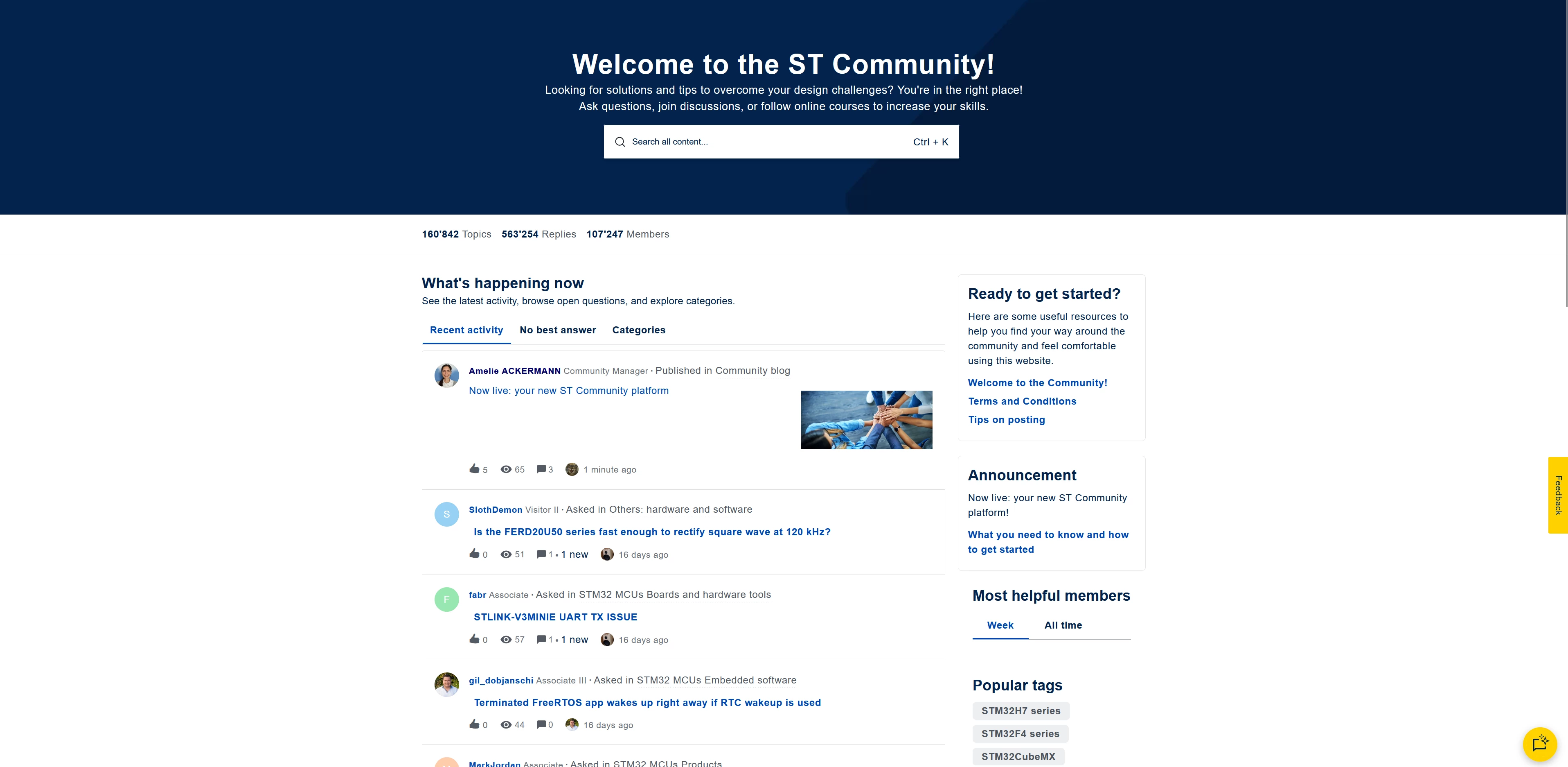
On the screen cap above, almost 1/3 of the screen is taken by the very large “Welcome” message + search box (the size of this can be divided by 2 without losing functionality, nor visibility).
The posts themselves also take a lot of height for no real reasons.
The point is, on a 32” monitor a lot of space is wasted and more information could be displayed at once.
Maybe there is a hidden setting for a compact view ? I know I wish there would be one…
Have a nice day !