- STMicroelectronics Community
- STM32 MCUs
- STM32 MCUs products
- New Template of Website - Menu
- Subscribe to RSS Feed
- Mark Topic as New
- Mark Topic as Read
- Float this Topic for Current User
- Bookmark
- Subscribe
- Mute
- Printer Friendly Page
New Template of Website - Menu
- Mark as New
- Bookmark
- Subscribe
- Mute
- Subscribe to RSS Feed
- Permalink
- Email to a Friend
- Report Inappropriate Content
2019-04-29 02:41 AM
Hello,
I apologize if I did not find a suitable place to raise this issue.
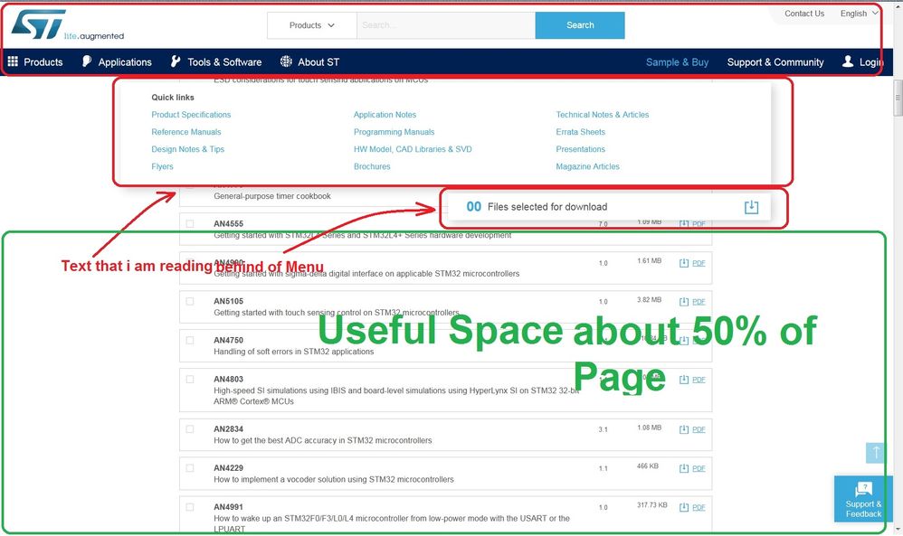
The new site template is improved, but there's a problem with its menu. On some pages of the website, when scrolling the page up and down, suddenly get a fix menu on the page, which in many cases, these menus are exactly on the text I'm reading, and this is sometimes an annoyance.
It's better to appear smoothly and when read the text, will not lose it.
It is a sample page from ST Website:
https://www.st.com/en/microcontrollers-microprocessors/stm32l476rg.html#tools-software
and this is a website example with smooth menu:
https://mmenujs.com/documentation/addons/page-scroll.html
Sample website for not lossing text when scroll up:
https://www.dtelepathy.com/blog/inspiration/14-beautiful-content-heavy-websites-for-inspiration
Or:
Thanke you
- Mark as New
- Bookmark
- Subscribe
- Mute
- Subscribe to RSS Feed
- Permalink
- Email to a Friend
- Report Inappropriate Content
2019-04-29 04:02 AM
Dear @Slh
thank your for your feedback. Could you please attach a screenshot of the menu which is causing the issue?
This will help me in following up on the issue.
- Mark as New
- Bookmark
- Subscribe
- Mute
- Subscribe to RSS Feed
- Permalink
- Email to a Friend
- Report Inappropriate Content
2019-04-29 05:11 AM
Hello Dear Francesco CARIATI,
I added a screenshot and send this link for example:
https://www.st.com/en/microcontrollers-microprocessors/stm32l476rg.html#resource
This happens both in the scroll-up and on the scroll down.
Also in the main menu included "Product", "Application", "Tools & Software" , ... As soon as the mouse cursor moves on it, it opens the menu. Usually, it is better to appear after a few milliseconds, the mouse stops.
Thanke you
- Mark as New
- Bookmark
- Subscribe
- Mute
- Subscribe to RSS Feed
- Permalink
- Email to a Friend
- Report Inappropriate Content
2019-04-29 06:40 AM
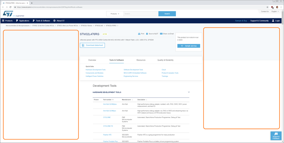
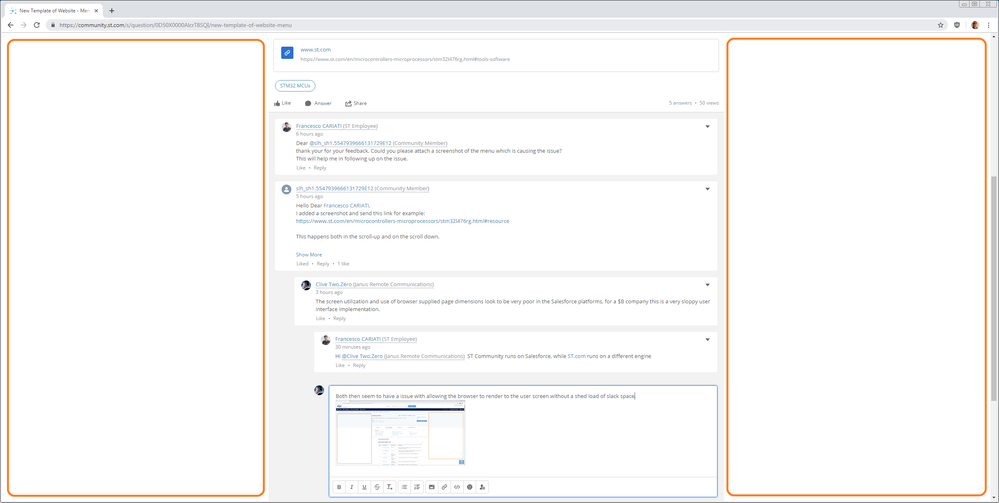
The screen utilization and use of browser supplied page dimensions look to be very poor in the Salesforce platforms, for a $B company this is a very sloppy user interface implementation.
- Mark as New
- Bookmark
- Subscribe
- Mute
- Subscribe to RSS Feed
- Permalink
- Email to a Friend
- Report Inappropriate Content
2019-04-29 09:31 AM
Dear @Slh
thank you for the detailed screenshot, very helpful.
Regarding the item in the red square, that part is on purpose "sticky" so that if the page is very long because many resources are available for that product,
you don't need to scroll up and down to further refine your search.
The same applies for the Download cart, which allows you to download in a ZIP file multiple resources.
Regarding the delay on the opening of the top menu, we are aware of the issue and is already planned for a future maintenance release.
Let me know if you need further clarifications
- Mark as New
- Bookmark
- Subscribe
- Mute
- Subscribe to RSS Feed
- Permalink
- Email to a Friend
- Report Inappropriate Content
2019-04-29 09:32 AM
Hi @Community member ST Community runs on Salesforce, while ST.com runs on a different engine
- Mark as New
- Bookmark
- Subscribe
- Mute
- Subscribe to RSS Feed
- Permalink
- Email to a Friend
- Report Inappropriate Content
2019-04-29 10:04 AM
- Mark as New
- Bookmark
- Subscribe
- Mute
- Subscribe to RSS Feed
- Permalink
- Email to a Friend
- Report Inappropriate Content
2019-04-29 10:29 AM
Hi @Community member
this is actually done on purpose, to keep elements which need to be read (e.g. text) within the 60 degrees near-peripheral area ( +/- 30 deg from the center focus).
This avoids head movements and reduces eye strain. You can try for yourself maxing out to full screen width a plain text document VS limiting it to 50% width.
- Event dispatching/bubbling and event interception in STM32 MCUs TouchGFX and GUI
- X-NUCLEO-LPM01A and STM32 Cube Monitor-Power: Cannot detect board on Debian 12 Linux in STM32CubeMonitor (MCUs)
- How does the scrollwheel item update method work? The itemIndex is different from the currently selected item. in STM32 MCUs TouchGFX and GUI
- OT On the st.com website (not this forum, but the "main" ST site) degradation in STM32 MCUs products
- X-CUBE-TOUCHGFX 4.18.1 is out in STM32 MCUs TouchGFX and GUI


